Matplotlib
Although matplotlib is not included in the standard library of python it is a python library widely used by pythonists. Quoting the official webpage :
Matplotlib is a comprehensive library for creating static, animated, and interactive visualizations in Python.
The official webpage has lots of resources for its users including the Code API, cheatsheets as well as examples. For installation please follow their getting started section and/or their installation guide
Basics
Simplest usage
The first thing that we are going to do is a simple plot with matplotlib and we will go step by step on how gain more control on the drawing through the different basic methods of matplotlib.
Note
If I was insistent on pymol's documentation being awesome, prepare to be dazzled by matplotlib's documentation
To make things easy let's say that we want to draw some experimental points
that are in a file name points.csv that has the following contents:
x,y
0,1.3
1,2.4
2,6.0
3,4.8
4,7.2
5,9.0
For tutorial purposes we are going to read the file by hand (although we could easily use pandas and/or numpy to read it)
import numpy as np

ifile = 'points.csv'

points = []
with open(ifile,'r') as F:
    for i,line in enumerate(F):
        if i==0: # let's ignore the first line
            continue
        x,y = line.strip().split(',')
        points.append(float(x),float(y))

# and now lets transform it to a np.array
xy = np.array(points)
Great now we have a numpy array where the first column is the x of the experimental points and the second column is the y. If we want a simple plot we can use the high-level methods implemented in pyplot:
import matplotlib.pyplot as plt

plt.scatter(xy[:,0],xy[:,1])
plt.savefig('fast_figure.png') # this will save a raster image -> better to edit with GIMP
plt.savefig('fast_figure.svg') # this will save a vector image -> better to edit with Inkscape
if we instead want only a fast visualization without saving the figure we can instead use
plt.show()
Congrats! you have drawn your first figure using matplotlib! The key idea of this high-level interface is to use it for "quick-and-dirty plots" as you saw, the figure was generated in 3 lines of code: the import, the plot and the saving/showing steps.
Figure, Axes, Gridspec and kwargs
If we want to gain a bit more of control of our drawings we need to use the
basic structures of matplotlib: Figure, Axes and Gridspec
First we are going to start with the Figure. A Figure is a drawing and it is the
basic structure of any of our matplotlib figures (See, good programmers use
fairly obvious names).
Next we have the Axes. A Figure may contain multiple Axes
and each axes may have different data drawn. Each Axes has at least a xaxis and
a yaxis. They also have other properties that we will treat in more detail at a
later section. For now what we need to know is that the plotting actions are
carried out in an axes (scatter in our previous example), whereas drawing the
final image (savefig in the previous example) is carried out in the Figure
If we only use these two we can translate our previous example as follows:
import matplotlib.pyplot as plt

ofile = 'fast_figure.svg'

fig = plt.figure()
ax = fig.add_subplot()
ax.scatter(xy[:,0],xy[:,1])
fig.savefig(ofile)
Note
I want to condition you to default to saving images in .svg rather than showing them or saving them as .png so the following examples will only save the figure as .svg instead of providing other options.
Here we can provide some extra arguments to control the size of the figure as well as its quality:
import matplotlib.pyplot as plt

ofile = 'fast_figure.svg'

width,height = 6, 6 # these values are in inches
dpi = 150

fig = plt.figure(figsize=(width,height),dpi=dpi)
ax = fig.add_subplot()
ax.scatter(xy[:,0],xy[:,1])
fig.savefig(ofile)
Finally we move to the Gridspec. A Gridspec is kind of a
coordinate system within the figure that allows us to fine tune the positions
of the axes within the Figure.
import matplotlib.pyplot as plt

ofile = 'fast_figure.svg'

width,height = 6, 6 # these values are in inches
dpi = 150

fig = plt.figure(figsize=(width,height),dpi=dpi,constrained_layout=False)

# First we decide where the left and right side side of the axis are relative
# to the figure where 0 is the left edge of the figure and 1 is the right edge
left, right = 0.10, 0.9

# Next we decide where the top and bottom of the axis will be.
# Here 0 is the bottom side of the figure and 1 is the top side of the figure.
top, bottom = [0.95,
               0.075]

gs = fig.add_gridspec(left=left,right=right,top=top,bottom=bottom)

ax = fig.add_subplot(gs[0])
ax.scatter(xy[:,0],xy[:,1])
fig.savefig(ofile)
Ok. I do agree that the current code is not the most beautiful code, but note that
1st we have comments that would not usually be there and 2nd we are not taking
advantage of one of the core features of python and the matplotlib library,
the kwargs. Lets make change the code again a bit!
import matplotlib.pyplot as plt

ofile = 'fast_figure.svg'

width,height = 6, 6
dpi = 150

fig = plt.figure(figsize=(width,height),dpi=dpi,constrained_layout=False)

gridspec_kwds = dict()
gridspec_kwds['left'] = 0.1
gridspec_kwds['right'] = 0.9
gridspec_kwds['top'] = 0.95
gridspec_kwds['bottom'] = 0.075

gs = fig.add_gridspec(**gridspec_kwds)

ax = fig.add_subplot(gs[0])
ax.scatter(xy[:,0],xy[:,1])
fig.savefig(ofile)
Plot types ( .plot, .scatter, .imgshow, .bar, … )
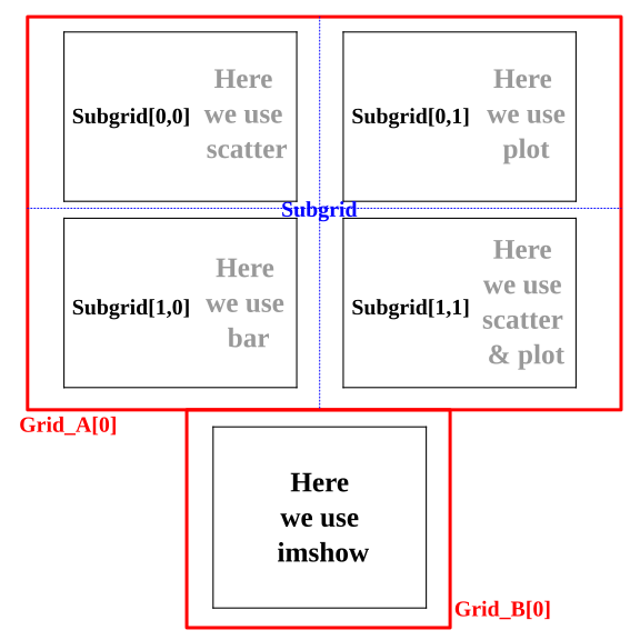
Now allow me to introduce some basic drawing methods that we can have in matplotlib (for a full list check the Plot types section of the pymol documentation) At the same time we will draw multiple axes in the same figure and try to exploit the gridspec to manipulate their distribution.
Here we are going to use the plot, scatter, bar,
imgshow methods to draw things on our axes. At the same time we are
going to distribute our image so that the axes are positioned as follows:
Note
It is really usefull to draw by hand an initial sketch of how you want your figure to look like in the end. After you have a sketch, build the base structure of your python script to draw the figure. No need to do the plotting just make sure that the axes are created. Then tweak the positions and dimensions of the figure to make sure that they fit the layout that you want. Finally proceed to do the plotting. If your plotting involves a complex logic you can always create a single function per axes that takes an axes and whatever extra parameters that you need, and handles all the formatting related with that axes as well as the plotting.
First let's start generating the layout:
import matplotlib.pyplot as plt

ofile = 'composite_figure.svg'

width,height = 6, 6
dpi = 150

fig = plt.figure(figsize=(width,height),dpi=dpi,constrained_layout=False)

# We create the grid_A
gridspec_A_kwds = dict()
gridspec_A_kwds['left'] = 0.1
gridspec_A_kwds['right'] = 0.95
gridspec_A_kwds['top'] = 0.95
gridspec_A_kwds['bottom'] = 0.4
gridspec_A_kwds['ncols'] = 1
gridspec_A_kwds['nrows'] = 2
gridspec_A_kwds['hspace'] = 0.1

grid_A = fig.add_gridspec(**gridspec_A_kwds)
subgrid_kwds = {'ncols':2,
                'nrows':2,
                'hspace':0.1}
subgrid = grid_A[0].subgridspec(**subgrid_kwds)

# We create the grid_B
gridspec_B_kwds = dict()
gridspec_B_kwds['left'] = 0.333
gridspec_B_kwds['right'] = 0.666
gridspec_B_kwds['top'] = 0.333
gridspec_B_kwds['bottom'] = 0.05

grid_B = fig.add_gridspec(**gridspec_B_kwds)

# Now we create the axes
ax_A00 = fig.add_subplot(subgrid[0,0])
ax_A01 = fig.add_subplot(subgrid[0,1])
ax_A10 = fig.add_subplot(subgrid[1,0])
ax_A11 = fig.add_subplot(subgrid[1,1])
ax_B = fig.add_subplot(grid_B[0])

fig.savefig(ofile)
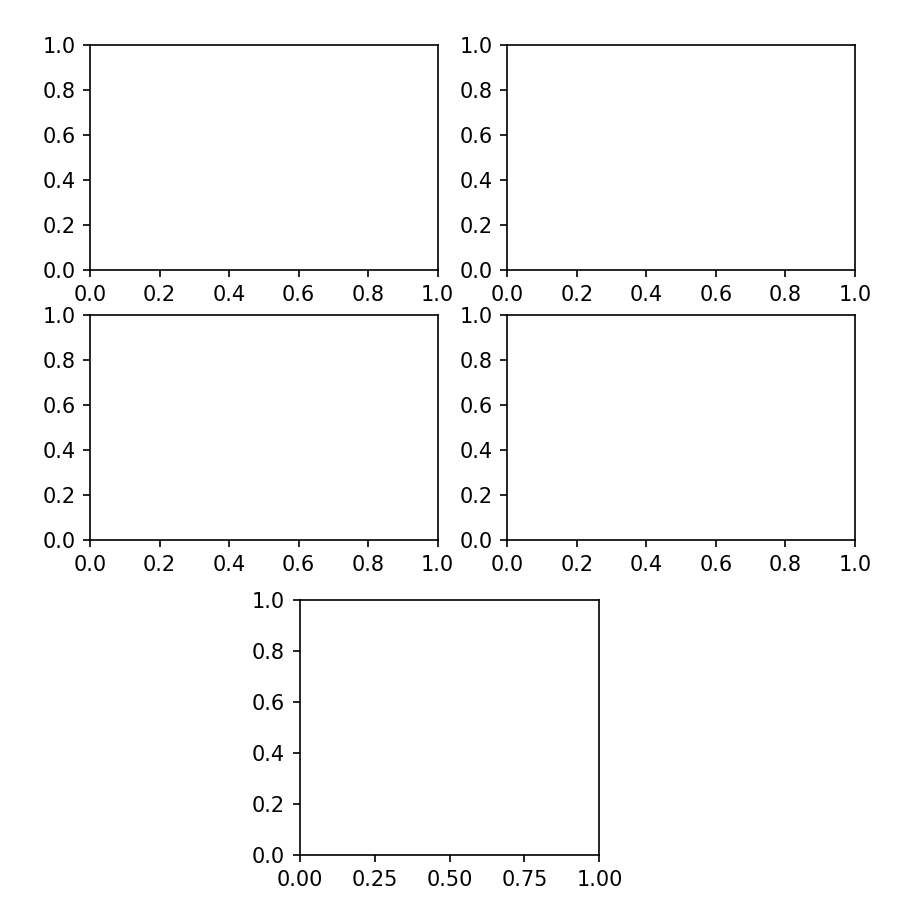
I know, it looks like a lot of code, but it is written in this manner so that adapting the code for a new figure as well as to tweak its positioning is easy. The figure that we have just saved to see the layout will look like this:
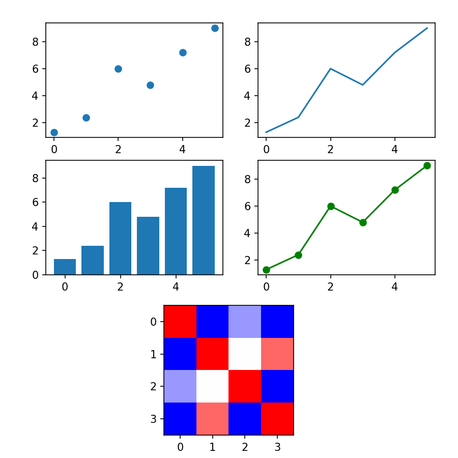
Now that we have the layout that we want let's include the different plots, As we have a small number of points we can directly create the array "by hand" rather than reading it, so in this example we will proceed in that manner.
import matplotlib.pyplot as plt
import numpy as np

ofile = 'composite_figure.svg'

width,height = 6, 6
dpi = 150

fig = plt.figure(figsize=(width,height),dpi=dpi,constrained_layout=False)

# We create the grid_A
gridspec_A_kwds = dict()
gridspec_A_kwds['left'] = 0.1
gridspec_A_kwds['right'] = 0.95
gridspec_A_kwds['top'] = 0.95
gridspec_A_kwds['bottom'] = 0.4
gridspec_A_kwds['ncols'] = 1
gridspec_A_kwds['nrows'] = 2
gridspec_A_kwds['hspace'] = 0.1

grid_A = fig.add_gridspec(**gridspec_A_kwds)
subgrid_kwds = {'ncols':2,
                'nrows':2,
                'hspace':0.1}
subgrid = grid_A[0].subgridspec(**subgrid_kwds)

# We create the grid_B
gridspec_B_kwds = dict()
gridspec_B_kwds['left'] = 0.333
gridspec_B_kwds['right'] = 0.666
gridspec_B_kwds['top'] = 0.333
gridspec_B_kwds['bottom'] = 0.05

grid_B = fig.add_gridspec(**gridspec_B_kwds)

# Now we create the axes
ax_A00 = fig.add_subplot(subgrid[0,0])
ax_A01 = fig.add_subplot(subgrid[0,1])
ax_A10 = fig.add_subplot(subgrid[1,0])
ax_A11 = fig.add_subplot(subgrid[1,1])
ax_B = fig.add_subplot(grid_B[0])

# define the data to plot
xy = np.array([[0.0,1.3],
               [1.0,2.4],
               [2.0,6.0],
               [3.0,4.8],
               [4.0,7.2],
               [5.0,9.0]])

# Now let's plot !!
ax_A00.scatter(xy[:,0],xy[:,1])
ax_A01.plot(xy[:,0],xy[:,1])
ax_A10.bar(xy[:,0],xy[:,1])

# kwargs are not exclusive of gridspecs so let's use them to enforce the same
# color for the scatter and line plot!
ax_A11.scatter(xy[:,0],xy[:,1],color='green')
ax_A11.plot(xy[:,0],xy[:,1],color='green')

# Imshow allows us to plug an image, pixel by pixel within an axes, but it
# can also serve to draw correlation matrices which is what we are going to
# do here!
correlation = np.array([[1.0,0.0,0.3,0.0],
                        [0.0,1.0,0.5,0.8],
                        [0.3,0.5,1.0,0.0],
                        [0.0,0.8,0.0,1.0]])
img = ax_B.imshow(correlation,cmap='bwr',vmin=0,vmax=1)

fig.savefig(ofile)
This is how our image looks like now.
As we have saved it as a .svg we can edit it in inkscape to remove the axes labels and/or add titles, but in the next section we will see how to do this by hand.
Changing axes properties and cheatsheets
I probably have not mentioned that matplotlib's documentation is very very well done right? Look at these amazing cheatsheets !
Why am I mentioning this? because we are going to tune in a bit our previous figure remove unnecessary ticks in the axes, add titles, remove bounding boxes and even write some random text in our figure.
We are going to first remove the ticks and tick labels of the x axis in the top row and the tick labels of the y axis of the second column.
for ax in [ax_A00,ax_A01]:
    ax.set_xticklabels([])

for ax in [ax_A11,ax_A01]:
    ax.set_yticklabels([])
We can probably agree that a x axis with missing ticks in the bar plot looks weird, so let's fix it!
ax_A10.set_xticks(xy[:,0])
And why not have all the y axis of the top for plots reach until 10 and a bit more for aesthetics ? And just to mess with the labels what about using non-evenly spaced ticks ?
a_bit = 0.1
ymin,ymax = 0 - a_bit, 10 + a_bit
yticks = [1, 4, 5.5, 8, 8.25, 9.7]

for ax in [ax_A00,ax_A01,ax_A10,ax_A11]:
    ax.set_ylim((ymin,ymax))
    ax.set_yticks(yticks)
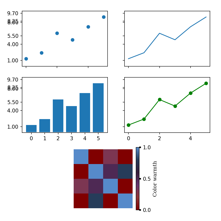
This is how the figure currently looks like!
I wouldn't say that it looks beautiful, but it's up to you to make it suit your taste!
Now we are going to completely remove the x axis and y axis from the bottom plot as well as the bounding box (spines)
for spine in 'top bottom right left'.split():
    ax_B.spines[spine].set_visible(False)

ax_B.xaxis.set_visible(False)
ax_B.yaxis.set_visible(False)
And now let's add a legend to the bottom plot to the right side
colorbar = plt.colorbar(img,ax=ax_B)
If you look at the matplotlib API documentation of
Colorbar
you will see that a Colorbar object, has an axes in the ax attribute.
This means that we can modify such axes as if it was any other axes. So let's
increase the thickness of the yaxis ticks. Let's add a ylabel and modify the yticks.
cax = colorbar.ax
cax.set_yticks([0,0.5,1])
cax.tick_params(axis='y',width=3.0)
cax.set_ylabel('Color warmth',fontfamily='Serif')
Now our full script to generate the figure looks like this:
import matplotlib.pyplot as plt
import numpy as np

ofile = 'composite_figure.svg'

width,height = 6, 6
dpi = 150

fig = plt.figure(figsize=(width,height),dpi=dpi,constrained_layout=False)

# We create the grid_A
gridspec_A_kwds = dict()
gridspec_A_kwds['left'] = 0.1
gridspec_A_kwds['right'] = 0.95
gridspec_A_kwds['top'] = 0.95
gridspec_A_kwds['bottom'] = 0.4
gridspec_A_kwds['ncols'] = 1
gridspec_A_kwds['nrows'] = 2
gridspec_A_kwds['hspace'] = 0.1

grid_A = fig.add_gridspec(**gridspec_A_kwds)
subgrid_kwds = {'ncols':2,
                'nrows':2,
                'hspace':0.1}
subgrid = grid_A[0].subgridspec(**subgrid_kwds)

# We create the grid_B
gridspec_B_kwds = dict()
gridspec_B_kwds['left'] = 0.333
gridspec_B_kwds['right'] = 0.666
gridspec_B_kwds['top'] = 0.333
gridspec_B_kwds['bottom'] = 0.05

grid_B = fig.add_gridspec(**gridspec_B_kwds)

# Now we create the axes
ax_A00 = fig.add_subplot(subgrid[0,0])
ax_A01 = fig.add_subplot(subgrid[0,1])
ax_A10 = fig.add_subplot(subgrid[1,0])
ax_A11 = fig.add_subplot(subgrid[1,1])
ax_B = fig.add_subplot(grid_B[0])

# define the data to plot
xy = np.array([[0.0,1.3],
               [1.0,2.4],
               [2.0,6.0],
               [3.0,4.8],
               [4.0,7.2],
               [5.0,9.0]])

# Now let's plot !!
ax_A00.scatter(xy[:,0],xy[:,1])
ax_A01.plot(xy[:,0],xy[:,1])
ax_A10.bar(xy[:,0],xy[:,1])

ax_A11.scatter(xy[:,0],xy[:,1],color='green')
ax_A11.plot(xy[:,0],xy[:,1],color='green')

correlation = np.array([[1.0,0.0,0.3,0.0],
                        [0.0,1.0,0.5,0.8],
                        [0.3,0.5,1.0,0.0],
                        [0.0,0.8,0.0,1.0]])
img = ax_B.imshow(correlation,cmap='bwr',vmin=0,vmax=1)

# Axes formatting
for ax in [ax_A00,ax_A01]:
    ax.set_xticklabels([])

for ax in [ax_A11,ax_A01]:
    ax.set_yticklabels([])

ax_A10.set_xticks(xy[:,0])

a_bit = 0.1
ymin,ymax = 0 - a_bit, 10 + a_bit
yticks = [1, 4, 5.5, 8, 8.25, 9.7]

for ax in [ax_A00,ax_A01,ax_A10,ax_A11]:
    ax.set_ylim((ymin,ymax))
    ax.set_yticks(yticks)

for spine in 'top bottom right left'.split():
    ax_B.spines[spine].set_visible(False)

ax_B.xaxis.set_visible(False)
ax_B.yaxis.set_visible(False)

colorbar = plt.colorbar(img,ax=ax_B)
cax = colorbar.ax
cax.set_yticks([0,0.5,1])
cax.tick_params(axis='y',width=3.0)
cax.set_ylabel('Color warmth',fontfamily='Serif')

fig.savefig(ofile)
Colors and creating a custom colormap
Probably you noticed the keyword cmap before when we were using imshow.
This keyword stands for 'color map' and we can find
here all the
already existing colormaps available in matplotlib. Now we are going to create
our own color map. and use it instead of the 'bwr' that we used previously.
The simplest way to create a colormap is by providing a sequence of colors:
from matplotlib.colors import LinearSegmentedColormap

custom_colors = [(128,0,0),
                 (146,54,54),
                 (103,54,112),
                 (80,0,220),#(94,0,206),
                 (0,21,128),
                 (38,61,90),
                 (86,138,202)]
custom_colors = [(r/256,g/256,b/256) for r,g,b in custom_colors]
cmap = LinearSegmentedColormap.from_list('custom',custom_colors,N=256)
Now, we can see that providing the colors in RGB can be bothersome as per each color that we select we need to write down three different numbers. Depending on where we look for those numbers they will be either between 0 and 256 or between 0 and 1. Here we have the same code but providing the colors in html notation:
from matplotlib.colors import LinearSegmentedColormap, to_rgba

custom_colors = ['#800000ff',
                 '#923636ff',
                 '#673670ff',
                 '#371d3bff',
                 '#263d5aff',
                 '#568acaff']
custom_colors = list(map(to_rgba,custom_colors))
cmap = LinearSegmentedColormap.from_list('custom',custom_colors,N=256)
With this we are ready to go, all that we need to do is to include this cmap in our previous code and we will see our new color map in action!
import matplotlib.pyplot as plt
import numpy as np
from matplotlib.colors import LinearSegmentedColormap, to_rgba

ofile = 'composite_figure.svg'

custom_colors = ['#800000ff',
                 '#923636ff',
                 '#673670ff',
                 '#371d3bff',
                 '#263d5aff',
                 '#568acaff']
custom_colors = list(map(to_rgba,custom_colors))
cmap = LinearSegmentedColormap.from_list('custom',custom_colors,N=256)

width,height = 6, 6
dpi = 150

fig = plt.figure(figsize=(width,height),dpi=dpi,constrained_layout=False)

# We create the grid_A
gridspec_A_kwds = dict()
gridspec_A_kwds['left'] = 0.1
gridspec_A_kwds['right'] = 0.95
gridspec_A_kwds['top'] = 0.95
gridspec_A_kwds['bottom'] = 0.4
gridspec_A_kwds['ncols'] = 1
gridspec_A_kwds['nrows'] = 2
gridspec_A_kwds['hspace'] = 0.1

grid_A = fig.add_gridspec(**gridspec_A_kwds)
subgrid_kwds = {'ncols':2,
                'nrows':2,
                'hspace':0.1}
subgrid = grid_A[0].subgridspec(**subgrid_kwds)

# We create the grid_B
gridspec_B_kwds = dict()
gridspec_B_kwds['left'] = 0.333
gridspec_B_kwds['right'] = 0.666
gridspec_B_kwds['top'] = 0.333
gridspec_B_kwds['bottom'] = 0.05

grid_B = fig.add_gridspec(**gridspec_B_kwds)

# Now we create the axes
ax_A00 = fig.add_subplot(subgrid[0,0])
ax_A01 = fig.add_subplot(subgrid[0,1])
ax_A10 = fig.add_subplot(subgrid[1,0])
ax_A11 = fig.add_subplot(subgrid[1,1])
ax_B = fig.add_subplot(grid_B[0])

# define the data to plot
xy = np.array([[0.0,1.3],
               [1.0,2.4],
               [2.0,6.0],
               [3.0,4.8],
               [4.0,7.2],
               [5.0,9.0]])

# Now let's plot !!
ax_A00.scatter(xy[:,0],xy[:,1])
ax_A01.plot(xy[:,0],xy[:,1])
ax_A10.bar(xy[:,0],xy[:,1])

ax_A11.scatter(xy[:,0],xy[:,1],color='green')
ax_A11.plot(xy[:,0],xy[:,1],color='green')

correlation = np.array([[1.0,0.0,0.3,0.0],
                        [0.0,1.0,0.5,0.8],
                        [0.3,0.5,1.0,0.0],
                        [0.0,0.8,0.0,1.0]])
img = ax_B.imshow(correlation,cmap=cmap,vmin=0,vmax=1)

# Axes formatting
for ax in [ax_A00,ax_A01]:
    ax.set_xticklabels([])

for ax in [ax_A11,ax_A01]:
    ax.set_yticklabels([])

ax_A10.set_xticks(xy[:,0])

a_bit = 0.1
ymin,ymax = 0 - a_bit, 10 + a_bit
yticks = [1, 4, 5.5, 8, 8.25, 9.7]

for ax in [ax_A00,ax_A01,ax_A10,ax_A11]:
    ax.set_ylim((ymin,ymax))
    ax.set_yticks(yticks)

for spine in 'top bottom right left'.split():
    ax_B.spines[spine].set_visible(False)

ax_B.xaxis.set_visible(False)
ax_B.yaxis.set_visible(False)

colorbar = plt.colorbar(img,ax=ax_B)
cax = colorbar.ax
cax.set_yticks([0,0.5,1])
cax.tick_params(axis='y',width=3.0)
cax.set_ylabel('Color warmth',fontfamily='Serif')

fig.savefig(ofile)